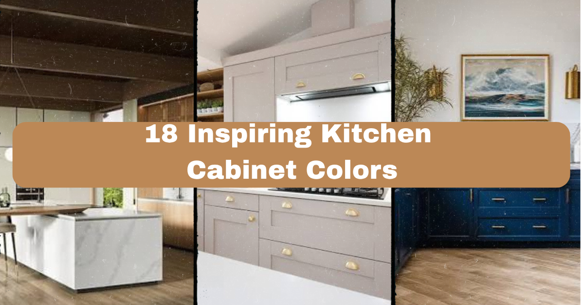
I’ve spent way too many nights scrolling through paint swatches trying to figure out the best kitchen cabinet colors, so I put together this list of 18 inspiring kitchen cabinet colors to save you the headache. If you’ve ever stood in your kitchen and thought “something’s off but I can’t tell what,” this article is for you.
What are the best kitchen cabinet colors for 2024 and beyond? The best cabinet colors include warm neutrals like greige and cream, bold choices like navy and forest green, and two-tone combos mixing dark lowers with light uppers. The right pick depends on your kitchen’s light, size, and the mood you want.
Stick around and I’ll walk you through 18 real, doable cabinet color ideas, plus a few mistakes I made so you don’t have to repeat them.
What Makes Kitchen Cabinet Color So Important Anyway?
Here’s the thing about cabinets. They take up more visual space than your walls, your floor, even your countertops in most kitchens. So the color you pick basically sets the whole mood before anyone notices anything else. I learned this the hard way when I painted my first kitchen a trendy gray and it felt like a hospital hallway by winter. Light, room size, and even your cookware color all play into what actually works. This isn’t about chasing trends. It’s about picking a color that makes you want to hang out in there. Let’s get into the actual colors now.
1. Warm White for a Timeless, Airy Feel
Warm white is not the same as bright white. It’s got a hint of cream or beige mixed in, so it doesn’t feel cold or clinical. This color bounces light around small kitchens really well, which makes tight spaces feel bigger than they are.
Pair warm white cabinets with brass or matte black hardware for contrast. Wood floors underneath tie the whole thing together nicely.
Practical tip: Test the paint in both morning and evening light before committing, since warm white can look yellow under certain bulbs.
This works in farmhouse, coastal, and traditional kitchens equally well. Next up is a color that’s basically the moodier cousin of warm white.
2. Greige for the Best of Both Worlds
Greige is that gray-beige hybrid everyone can’t stop talking about, and honestly, it earns the hype. It’s neutral enough to not go out of style but has enough warmth to avoid feeling sterile.
I’d pair greige with brushed nickel hardware and a white quartz counter. It plays well with almost any backsplash tile you throw at it.
Practical tip: Stick with a matte or satin finish, since glossy greige can look plasticky under kitchen lighting.
Greige adapts to modern, transitional, and farmhouse styles without missing a beat. Now let’s talk about a color that makes a much louder statement.
3. Navy Blue for Bold, Grounded Elegance
Navy blue cabinets feel rich without being loud. They photograph beautifully and give your kitchen a sense of weight and intention, like you actually thought about the design instead of just picking “safe.”
Use navy on lower cabinets only if you want a lighter overall feel, or go all-navy for drama. Gold or brass hardware makes navy pop even more.
Practical tip: Balance dark navy with a light-colored countertop so the room doesn’t feel cave-like.
Navy fits coastal, traditional, and modern farmhouse kitchens really well. Let’s lighten things up a bit with the next color.
4. Sage Green for a Calm, Nature-Inspired Vibe
Sage green cabinets bring a soft, earthy calm into the kitchen without feeling like a forest theme. It’s muted enough to feel grown-up but still adds real color, unlike the beige everyone’s tired of.
Pair sage with natural wood accents and cream walls. Open shelving in this color scheme looks especially good holding ceramics or plants.
Practical tip: Choose a slightly grayed-down sage rather than a bright green to keep the look sophisticated.
Sage green works beautifully in cottage, farmhouse, and Scandinavian-style kitchens. Moving on to a color combo that’s having a real moment right now.
Quick Comparison: Popular Cabinet Colors by Style Match
| Cabinet Color | Best Style Match | Light Requirement | Hardware Pairing |
|---|---|---|---|
| Warm White | Coastal, Farmhouse | Any lighting | Brass, matte black |
| Greige | Modern, Transitional | Medium to bright | Nickel, chrome |
| Navy Blue | Traditional, Modern Farmhouse | Bright natural light | Gold, brass |
| Sage Green | Cottage, Scandinavian | Medium light | Brushed brass |
| Charcoal Gray | Industrial, Modern | Bright light preferred | Black, matte gray |
5. Two-Tone Cabinets for Visual Interest
Two-tone kitchens mix a dark lower cabinet color with a lighter upper cabinet color, and it’s one of the smartest tricks in kitchen design. It grounds the room while keeping things from feeling heavy overhead.
A classic combo is navy lowers with white uppers, or forest green lowers with cream uppers. This trick also draws the eye around the whole room instead of flattening everything into one tone.
Practical tip: Keep your island a third color if you want an even more custom, designed look.
Two-tone setups fit modern, transitional, and eclectic kitchens especially well. Speaking of islands, let’s talk about that specifically next.
6. A Contrasting Island Color for a Custom Look
Painting just your island a different color instantly makes your kitchen look like it was designed by a pro, even on a budget. It’s one change, but it makes a huge visual impact.
Try a deep green or navy island against white perimeter cabinets. Add a wood countertop on the island to soften the contrast even more.
Practical tip: Match your island color to something already in the room, like a light fixture or barstool fabric, so it feels intentional.
This idea works in basically every kitchen style, from modern to farmhouse to traditional. Now let’s go darker with a color that’s surprisingly versatile.
7. Charcoal Gray for Understated Drama
Charcoal isn’t quite black, so it avoids that stark, cold feeling while still bringing serious depth to a room. It’s a great middle ground if you want moody without full commitment.
Pair charcoal with warm wood tones and brass fixtures to keep it from feeling too industrial. White countertops help lighten the overall look too.
Practical tip: Use charcoal in kitchens with plenty of natural light, since it can swallow light in darker rooms.
Charcoal gray suits industrial, modern, and even traditional kitchens depending on the finishing details. Let’s shift gears to something a little more playful now.
8. Terracotta for Warm, Earthy Character
Terracotta cabinets bring a sunbaked, Mediterranean warmth that feels different from anything else on this list. It’s not a color you see often, which makes it stand out in a good way.
Pair terracotta with cream walls and natural stone counters. Woven baskets or rattan light fixtures complete the earthy vibe.
Practical tip: Use terracotta on a small section, like an island or pantry cabinet, if you’re nervous about committing to the whole kitchen.
This color shines in Mediterranean, boho, and Southwestern-style kitchens. Next, let’s cool things down with a shade that’s the opposite of terracotta.
9. Soft Blue-Gray for a Relaxed Coastal Feel
Soft blue-gray cabinets feel like a cloudy beach day, calm and easy on the eyes. It’s a gentler alternative to full navy if you want color without the drama.
Pair it with white subway tile and brushed gold hardware. Light wood floors keep the whole space feeling airy.
Practical tip: Add texture through woven bar stools or linen curtains so the calm color doesn’t feel flat.
Blue-gray works especially well in coastal, cottage, and transitional kitchens. Let’s move to a color that’s a little more daring.
10. Black Cabinets for Sleek, Modern Confidence
Black cabinets sound intimidating, but done right, they look incredibly sharp and modern. The trick is balancing them with plenty of light and texture elsewhere in the room.
Pair black lower cabinets with white uppers, or go full black with brass hardware for serious drama. Marble countertops soften the hard edges nicely.
Practical tip: Use a satin finish, not matte, so the black doesn’t feel flat or heavy in the room.
Black works best in modern, industrial, and contemporary farmhouse kitchens. Let’s look at a warmer alternative next.
11. Butter Yellow for a Cheerful, Retro Touch
Butter yellow cabinets bring a nostalgic, sunny feeling that’s honestly pretty rare in modern kitchens. It’s a color that makes a room feel happy without screaming for attention.
Pair butter yellow with white counters and simple black hardware to keep it from feeling too retro-kitschy. Checkered floors amplify the vintage charm if that’s your style.
Practical tip: Use yellow only on lower cabinets or an island if you’re worried about it feeling overwhelming.
This color fits vintage, cottage, and eclectic kitchen styles particularly well. Now let’s try a deep, jewel-toned option.
12. Forest Green for Rich, Nature-Inspired Depth
Forest green cabinets feel luxurious and grounded at the same time, like a really nice cabin but elevated. It’s darker than sage, so it makes more of a statement.
Pair forest green with brass hardware and cream walls for contrast. Marble or butcher block counters both work nicely here.
Practical tip: Add under-cabinet lighting since dark green can hide details in low light.
Forest green suits traditional, modern farmhouse, and even art deco-inspired kitchens. Let’s talk budget planning before we look at a few more shades.
Budget Guide: Cabinet Color Changes by Method
| Method | Average Cost Range | Time Needed | Best For |
|---|---|---|---|
| DIY Painting | $200 to $600 | 2 to 4 days | Budget-conscious homeowners |
| Professional Painting | $1,500 to $4,000 | 3 to 7 days | Long-lasting, smooth finish |
| Cabinet Refacing | $4,000 to $9,000 | 1 to 2 weeks | Changing color and style at once |
| Full Cabinet Replacement | $8,000 to $25,000+ | 3 to 6 weeks | Complete kitchen overhaul |
13. Dusty Rose for Subtle, Feminine Warmth
Dusty rose cabinets are softer than they sound, more of a muted mauve than anything Barbie-pink. It’s a surprisingly sophisticated choice that a lot of people overlook.
Pair dusty rose with brass hardware and white marble counters. Sage green accents actually pair beautifully with this color too.
Practical tip: Keep walls neutral so the cabinets stay the star of the room.
This color works in modern, transitional, and eclectic kitchens. Let’s check out a moody alternative next.
14. Deep Plum for Unexpected Richness
Deep plum cabinets are a bold move, but they bring a richness that’s hard to get from any other color. It reads almost black in low light but reveals purple undertones in the sun.
Pair plum with gold hardware and light gray countertops to balance the darkness. Keep upper cabinets or open shelving lighter if you use plum below.
Practical tip: Test a large sample board in your kitchen since plum shifts dramatically under different lighting.
Plum fits modern, glam, and eclectic kitchen styles best. Now let’s talk about a soft, in-between neutral.
15. Oatmeal for a Cozy, Understated Neutral
Oatmeal cabinets sit between beige and gray, giving you warmth without leaning too yellow. It’s one of the most livable colors on this list because it goes with basically everything.
Pair oatmeal with black hardware for contrast or brass for warmth. Both directions work equally well.
Practical tip: Use oatmeal if you plan to change your decor style often, since it’s the most flexible base color here.
Oatmeal fits farmhouse, transitional, and Scandinavian kitchens without any adjustment needed. Let’s wrap up the color list with a few more unique choices.
16. Mustard Yellow for a Bold Retro Statement
Mustard is bolder than butter yellow, leaning more into a 70s-inspired warmth. It’s not for everyone, but in the right kitchen, it feels genuinely joyful.
Pair mustard with dark wood floors and black hardware. Keep counters simple, like white quartz, so the cabinets stay the focus.
Practical tip: Use mustard on an island only if you’re testing the waters before going all-in.
This color suits retro, eclectic, and bohemian kitchen styles especially well.
17. Slate Blue for Moody Sophistication
Slate blue sits between navy and gray, giving you drama without full darkness. It reads differently depending on the light, sometimes blue, sometimes almost gray-green.
Pair slate blue with brushed nickel hardware and white oak flooring. This combo feels calm but still designed.
Practical tip: Match slate blue with cool-toned countertops like white quartz rather than warm beige stone.
Slate blue fits modern, coastal, and transitional kitchens really well.
18. Cream for Soft, Classic Warmth
Cream is warmer than white but softer than beige, giving you a classic look that never really goes out of style. It’s a safe choice, but safe doesn’t mean boring here.
Pair cream with gold hardware and marble backsplash for a timeless combo. Wood floors underneath tie it together nicely.
Practical tip: Choose cream over stark white if your kitchen gets a lot of harsh, cool light.
Cream fits traditional, French country, and farmhouse kitchens especially well.
Tips for Success
- Test your color choice on an actual cabinet door sample, not just a paint chip, since lighting changes everything.
- Consider your countertop and backsplash color before picking cabinets, since those are harder to change later.
- Go bold on lower cabinets and lighter on uppers if you’re nervous about committing to a strong color.
- Always use cabinet-grade paint or professional-grade materials, since kitchen cabinets take a beating daily.
- Live with your color choice on a small area, like a pantry door, for a week before painting everything.
- Keep hardware finish consistent throughout the kitchen for a cohesive, intentional look.
- Don’t ignore your flooring color, since it needs to work with your cabinet choice, not against it.
Common Mistakes and How to Avoid Them
Choosing a trendy color without testing it in your own lighting
: Every kitchen has different light. Always sample the actual paint in your space before committing to a full repaint.
Ignoring the finish sheen
: Glossy paint shows fingerprints and dust more, while matte can be harder to clean. Satin finish is usually the safest middle ground for cabinets.
Matching cabinets and walls too closely
: When cabinets and walls are nearly the same shade, the room can look flat and boring. Add contrast through wall color, backsplash, or hardware.
Going too dark in a small, low-light kitchen
: Dark cabinets can make small rooms feel smaller and closed in. Save deep colors for kitchens with strong natural light or add extra lighting fixtures.
Forgetting about resale value
: Extremely bold colors can turn off future buyers. If resale is a concern, keep bold colors to an island or accent area only.
Skipping proper prep work before painting
: Cabinets need sanding and primer before paint, or the finish will chip fast. Never skip prep steps even if you’re in a rush.
Similar Variations
- Two-Tone Kitchen Cabinets: Mixing two colors across upper and lower cabinets for contrast and depth.
- Ombre Cabinet Fronts: Gradually shifting from dark to light shades across a run of cabinets for a modern, artistic look.
- Mixed Material Cabinets: Combining painted cabinets with natural wood sections for texture and warmth.
- Monochrome Kitchens: Using one color family across cabinets, walls, and even ceiling for a cohesive, immersive feel.
- Vintage-Inspired Color Palettes: Pulling shades like mustard, avocado green, or harvest gold for a retro throwback kitchen.
Picking the right shade really comes down to your lighting, your kitchen size, and honestly, what makes you happy every time you walk in. There’s no single “correct” answer here, just the color that fits your life and your space best. I hope this list of 18 inspiring kitchen cabinet colors gave you a real starting point, whether you’re ready to go bold or just want a safer, timeless update.
Leave a Reply