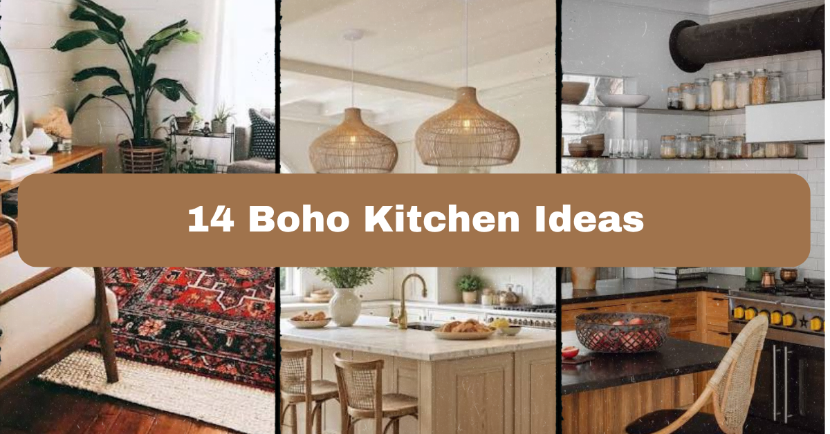
If you’ve been scrolling Pinterest for hours trying to find 14 boho kitchen ideas that actually work in a real home (not just a magazine spread), I’ve got you covered. I’ve pulled together the most practical, doable ideas out there, so you can skip the guesswork and get straight to decorating.
Boho kitchen design blends natural materials, warm colors, and eclectic decor to create a relaxed, personal cooking space. It relies on textures like rattan, wood, and woven fabrics paired with plants, vintage finds, and earthy tones to feel cozy rather than cluttered.
Stick around, because I’m about to walk you through everything from budget-friendly swaps to full kitchen makeovers, plus the mistakes that trip up almost everyone.
What Even Is a Boho Kitchen, Anyway?
Okay, so let’s back up for a second. Boho, short for bohemian, is all about mixing things that shouldn’t work together but somehow do. Think worn leather stools next to a woven pendant light. Or a vintage rug under a sleek marble counter. It’s not messy, though. It’s curated chaos, if that makes sense.
The whole point is to make your kitchen feel like it has a story. Nothing matches perfectly, and that’s the goal. You want warmth, texture, and a little bit of “I found this at a flea market in 2019” energy. It’s forgiving, budget-friendly, and honestly kind of fun to put together once you get the hang of it.
A jute or wool rug under your kitchen table instantly makes the space feel softer. Hard floors in kitchens can feel cold and sterile, so a textured rug breaks that up fast. Go for natural fibers like jute, sisal, or a Moroccan-style wool rug with faded patterns.
Practical tip: choose a low-pile rug so it’s easier to clean up spills and crumbs.
This idea works in almost any style. Coastal kitchens love a light jute weave, while traditional spaces might lean into a Persian-inspired rug with deeper reds and blues.
Once your floor feels grounded, it’s time to think about what’s happening above your head.
Lighting sets the mood, and boho kitchens thrive on warm, natural glow. Rattan pendant lights cast beautiful shadows on the walls and ceiling, adding texture even when the light’s off. They’re inexpensive too, often under $100, and easy to install if you’re swapping out a boring fixture.
Practical tip: cluster two or three pendants of different sizes over an island for a layered look instead of one big light.
Modern farmhouse kitchens can use a single oversized rattan pendant, while eclectic boho spaces might go with mismatched shapes for more personality. Speaking of islands, let’s talk about what goes on top of them.
Ditch the matching dish sets. Open shelves lined with mismatched ceramic bowls, vintage plates, and clay mugs give your kitchen that lived-in, collected-over-time feel. It also makes your favorite pieces part of the decor instead of hiding them in a cabinet.
Practical tip: group items by color family, not by set, so the shelf still feels intentional even with mismatched pieces.
Coastal boho kitchens might lean into blues and whites, while desert boho spaces look great with terracotta and cream tones. Now let’s get into color, because that’s where boho really shines.
No boho kitchen is complete without greenery. Trailing plants like pothos or string of pearls look amazing on open shelves or hanging near a window. Bigger plants, like a fiddle leaf fig, work well in corners if you’ve got the floor space.
Practical tip: use terracotta pots since they fit the earthy boho vibe and help wick moisture away from roots.
Modern kitchens can keep plants minimal and structured, maybe just one or two statement pots, while maximalist boho spaces go all in with plants on every surface. Next, let’s talk about what’s covering your windows.
Woven wood shades bring texture without blocking light completely. They’re a staple in boho design because they filter sunlight in a soft, warm way, unlike stark white blinds. Bamboo, rattan, and jute blinds all work great here.
Practical tip: pick a shade with a slight gap in the weave so light still filters through even when closed.
Traditional kitchens might pair these with fabric curtains for extra softness, while minimalist boho spaces let the blinds stand alone. Now let’s move to something a lot of people overlook: the backsplash.
Zellige tiles, with their irregular edges and glossy, handmade look, are a boho kitchen favorite. The slight imperfections in each tile catch the light differently, giving your backsplash depth that flat, mass-produced tile just can’t match.
Practical tip: if zellige tile is out of budget, look for ceramic tiles that mimic the handmade texture at a fraction of the cost.
Coastal boho kitchens often go with soft blue or seafoam zellige, while desert boho leans toward warm clay tones. Once your walls have texture, your cabinets are the next big canvas.
Skip the all-white kitchen. Boho style loves warm, muted colors like terracotta, olive green, mustard, or warm clay. These colors feel grounded and cozy, especially against natural wood and brass accents.
Practical tip: test paint samples on your actual cabinets and view them in both daylight and evening light before committing.
Modern boho kitchens might stick to one bold color, while eclectic spaces mix two-tone cabinets, like olive on top and natural wood on the bottom. Now that your cabinets have personality, let’s add some hardware to match.
Cabinet hardware is such a small detail, but it makes a huge difference. Brass, aged bronze, or unlacquered brass knobs and pulls add warmth instantly. They also develop a nice patina over time, which only adds to the lived-in boho feel.
Practical tip: mix knob and pull styles slightly, maybe rounded knobs on uppers and long bar pulls on lowers, for subtle variety.
Traditional kitchens might use ornate brass pulls, while modern boho spaces keep it simple with sleek matte black or brushed gold. Let’s talk countertops next, since they need to hold their own visually.
Wood countertops, especially butcher block, bring warmth and texture that boho kitchens crave. Soapstone is another great option since it has natural veining and a soft, matte finish that feels organic rather than cold like polished marble.
Practical tip: seal butcher block countertops every six months with food-safe mineral oil to keep them from drying out or cracking.
Farmhouse kitchens pair beautifully with butcher block, while modern boho spaces might choose a honed quartz that mimics natural stone. Now, let’s fill your counters with a few personal touches.
Baskets aren’t just for storage, they’re a design element. Stack a few on top of your cabinets, or use smaller ones on open shelves to hold fruit, utensils, or dish towels. The natural fiber texture softens all the hard lines in a kitchen.
Practical tip: use baskets with handles for anything you’ll grab often, like linens or produce.
Coastal kitchens look great with lighter, bleached baskets, while jungle boho spaces might use darker, chunkier woven styles. Let’s talk about a wall feature that ties everything together next.
11. Create a Gallery Wall with Vintage Art and Mirrors
An empty wall is a missed opportunity in a boho kitchen. Mix small vintage paintings, woven wall hangings, and an antique mirror or two for a curated, collected look. It doesn’t need to be symmetrical. In fact, it shouldn’t be.
Practical tip: lay your pieces out on the floor first to plan spacing before hammering a single nail.
Eclectic boho kitchens can go bold with mismatched frames, while minimalist boho spaces might stick to just two or three pieces with breathing room between them. Now, let’s think about the table where you’ll actually sit and eat.
A matched dining set feels stiff in a boho kitchen. Instead, pick two or three different chair styles, maybe a rattan chair, a wooden bench, and a vintage upholstered seat, and put them around the same table. It looks intentional, not random, when the colors tie together.
Practical tip: keep the wood tones within the same color family even if the chair shapes are different, so the mix still feels cohesive.
Traditional kitchens might mix antique chairs from different eras, while modern boho spaces pair one sleek chair style with a single rattan accent piece. Let’s zoom out and talk textiles next.
Throw pillows on a kitchen bench, a table runner with fringe, tea towels with tribal prints, these small textile touches add so much personality. Boho design is big on pattern mixing, so don’t be afraid to combine stripes, florals, and geometric prints as long as the color palette stays connected.
Practical tip: stick to two or three colors across all your textiles so the mixed patterns don’t feel chaotic.
Coastal boho leans into striped linen, while desert boho loves Southwestern-inspired prints in rust and cream. Now, let’s finish up with a detail that ties the whole room together.
A macrame wall hanging behind your sink or stove adds texture without taking up counter space. These pieces are affordable, easy to make yourself if you’re crafty, and instantly signal “boho” to anyone walking into the room.
Practical tip: hang macrame away from direct grease splatter zones, like above a stove, unless it’s easy to wash.
Minimalist boho spaces might use one small, simple macrame piece, while maximalist kitchens can layer multiple hangings of different sizes. That wraps up our big list, but let’s talk about how to actually pull this off successfully.
Tips for Success
Start with one or two big changes, like paint or lighting, before adding smaller decor pieces.
Keep a consistent color thread running through every element, even if textures and patterns vary.
Shop secondhand stores and flea markets first. Boho thrives on vintage, one-of-a-kind finds.
Don’t rush the plant situation. Start with one or two low-maintenance varieties and build from there.
Balance busy elements, like patterned tile, with calmer surfaces, like plain wood cabinets.
Test hardware finishes on your actual cabinets before buying enough for the whole kitchen.
Leave some empty space. Boho is layered, not cluttered, and breathing room matters.
Common Mistakes and How to Avoid Them
Overmatching everything
: Boho is about curated mismatch, not a coordinated set. If everything matches too perfectly, it stops feeling boho and starts feeling like a showroom.
Ignoring function for the sake of looks
: A gorgeous woven rug that’s impossible to clean isn’t worth it. Always check maintenance needs before committing to a decor piece in a working kitchen.
Too many colors at once
: Stick to a core palette of three to four colors. Adding a rainbow of shades makes the space feel chaotic instead of cozy.
Skipping texture
: A boho kitchen without texture, like rattan, jute, or woven fabric, ends up looking flat no matter how good the color scheme is.
Forgetting the ceiling and floor
: People decorate walls and counters but forget lighting fixtures and rugs. Those two elements pull a huge amount of visual weight in boho design.
Buying everything new
: Boho loses its charm without a few aged, vintage, or secondhand pieces mixed in. New-only decor can feel flat and impersonal.
Similar Variations
Desert Boho – warm terracotta tones, cacti, and Southwestern patterns for a sun-baked feel.
Coastal Boho – light woods, seafoam and sandy tones, plus rattan for a breezy beach house vibe.
Jungle Boho – deep greens, lots of plants, and dark wood for a lush, tropical feel.
Modern Boho – clean lines mixed with just a few natural textures for a more streamlined look.
Vintage Boho – heavy use of antique furniture and thrifted decor for a collected-over-decades feel.
Scandi Boho – light wood, white walls, and minimal clutter blended with cozy textiles.
Putting together a boho kitchen really comes down to layering textures, sticking to warm earthy colors, and mixing old with new instead of buying a matched set off the shelf. It doesn’t have to happen all at once, either. Start small, maybe with a rug or a pendant light, and build from there as your budget and confidence grow. Whichever direction you take it, these 14 boho kitchen ideas should give you more than enough inspiration to turn your kitchen into a warm, personal space you actually want to spend time in.
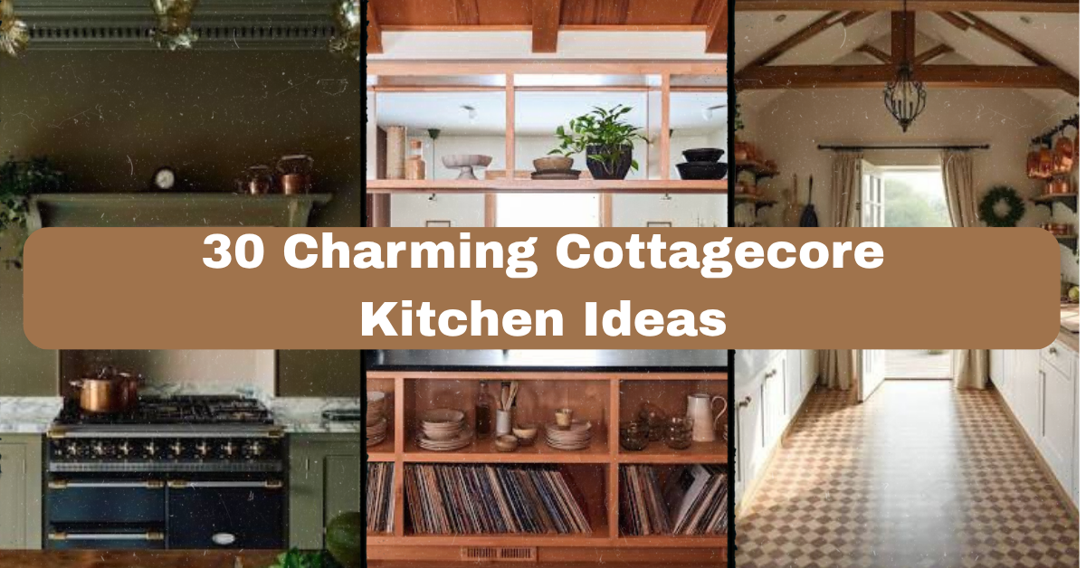
I’ve spent months digging through design boards, real farmhouse renovations, and cozy kitchen makeovers to bring you 30 Charming Cottagecore Kitchen Ideas that actually work in real homes, not just in dreamy photos. Ever scroll through cottagecore kitchens online and wonder how anyone gets that lived-in, storybook feel without it looking fake? I get it. You want the charm without the chaos.
Cottagecore kitchen design blends rustic farmhouse elements, vintage decor, and soft natural colors to create a warm, nostalgic cooking space. It draws from countryside living, handmade textures, and simple pleasures like herb gardens and open shelving. The result feels calm, personal, and grounded in nature.
Stick around, because I’m about to walk you through every corner of this style, from paint colors to tiny details you probably haven’t thought of yet.
What Exactly Is Cottagecore Kitchen Style?
Okay, so before we jump into the list, let’s talk about what cottagecore actually means. Think of your grandma’s kitchen, but curated. It’s that soft, romantic countryside vibe where everything feels handmade and unhurried. Cottagecore pulls from old farmhouses, English countryside cottages, and a slower way of living. You’ll see a lot of florals, gingham, wood, and dried herbs hanging around. It’s not about perfection. It’s about warmth. Honestly, it’s the opposite of those cold, sleek modern kitchens. This style says “come sit down, have some tea” instead of “don’t touch anything.” That’s the heart of it.
Sage green is basically the unofficial color of cottagecore kitchens. It’s calming, it feels natural, and it pairs beautifully with wood tones and white walls. I’ve seen this color transform boring cabinets into something that feels straight out of a countryside cottage.
Pick a matte or eggshell finish so it doesn’t look too glossy or modern. Pair it with brass or black hardware for contrast. A practical tip: test the paint on a small cabinet section first because lighting changes how green looks throughout the day.
This shade works in farmhouse, coastal, and even traditional kitchens without feeling out of place. Once your cabinets are sorted, let’s talk about what goes on your countertops next.
2. Add Open Wooden Shelving Instead of Upper Cabinets
Open shelves make a kitchen feel lighter and more personal. Instead of hiding your dishes behind cabinet doors, you display them. This is a huge part of cottagecore charm because it shows off mismatched vintage plates, jars, and teacups.
Use reclaimed wood or unfinished pine for that raw, natural texture. Style the shelves with a mix of ceramics, small potted herbs, and a few cookbooks stacked sideways. Tip: don’t overload the shelves. Leave breathing room so it doesn’t look cluttered.
This idea adapts well to rustic, Scandinavian, and industrial kitchens too, since open shelving is pretty universal. Next up, let’s talk about the floor beneath all that charm.
Flooring sets the whole tone of a cottagecore kitchen. Black and white checkered tile gives a vintage bakery feel, while terracotta tiles bring warmth and an old European farmhouse touch.
If you’re renting or on a budget, peel-and-stick vinyl tile mimics both looks convincingly. Choose matte finishes since glossy tile feels too modern for this style. A quick tip: add a woven rug near the sink to soften the look and protect the tile from wear.
Checkered flooring suits retro and diner-style kitchens, while terracotta leans more into Mediterranean and rustic farmhouse spaces. Now let’s move on to the heart of the kitchen: the sink area.
A deep, wide farmhouse sink is basically cottagecore royalty. It’s practical for washing big pots and it instantly gives your kitchen that old-world charm. White ceramic or fireclay sinks are the most popular choice for this look.
Pair it with a gooseneck faucet in brass or matte black. Keep a small windowsill above it stocked with potted herbs like basil or mint. Tip: add a printed curtain underneath instead of cabinet doors for extra texture and charm.
This works beautifully in farmhouse, French country, and even modern rustic kitchens. Speaking of curtains, let’s talk fabric choices next.
Fabric adds softness that hard surfaces can’t. Gingham curtains in red, blue, or yellow give a classic countryside feel, while small floral prints add a romantic touch.
Choose lightweight cotton or linen so the curtains move gently with airflow. Keep them short, just covering the lower half of the window, so natural light still pours in. Tip: use a simple tension rod for an affordable, no-drill install.
This idea fits cottagecore, French country, and vintage kitchen styles equally well. Now let’s shift to something that ties the whole room together: your color palette.
This one’s a total showstopper. Bundles of dried lavender, rosemary, or wildflowers hanging from a wooden beam or rack instantly scream cottagecore. It’s simple, cheap, and smells amazing too.
Use twine to tie small bunches and hang them from hooks or a drying rack. Rotate them every few months so they stay fresh looking, not dusty. Tip: group odd numbers of bundles together, like three or five, for a more natural arrangement.
This works in farmhouse, boho, and rustic kitchens without much adjustment. Next, let’s talk about something practical that also looks gorgeous: your storage jars.
Ditch the plastic bags and boxes. Clear glass jars filled with flour, sugar, oats, and pasta look tidy and charming at the same time. Add handwritten or printed labels for that cozy, homemade touch.
Stick to uniform jar shapes for a cleaner look, or mix vintage mason jars for more character. Keep them on open shelves or a dedicated pantry counter. Tip: use chalkboard labels so you can easily update them when contents change.
This idea works in minimalist, farmhouse, and even coastal kitchens. Now let’s bring some greenery into the mix.
Nothing says cottagecore like fresh herbs growing right in your kitchen. Basil, thyme, mint, and parsley are easy to grow indoors and give you fresh ingredients whenever you cook.
Use small terracotta pots for a rustic touch, or mismatched vintage teacups for something quirky. Place them where they’ll get at least four hours of sunlight daily. Tip: group pots on a wooden tray so watering doesn’t damage your windowsill.
This idea suits nearly every kitchen style, from modern to traditional. Let’s talk lighting next, because it changes everything.
Lighting makes or breaks the cottagecore vibe. Cold white LED bulbs kill the mood instantly. Instead, go for warm-toned bulbs in vintage-style fixtures like glass globes or wrought iron pendants.
Hang pendants above your island or sink at a height that feels cozy, not clinical. Tip: use bulbs labeled “warm white” or around 2700K for that golden, glowing look.
This works across farmhouse, industrial, and traditional kitchens alike. Now let’s get into furniture choices for your kitchen island or table.
If you have space for a table in your kitchen, go for something that looks like it’s been loved for decades. Distressed or reclaimed wood tables bring authenticity that new furniture just can’t fake.
Pair it with mismatched wooden chairs, maybe a couple with woven seats. Add a simple table runner in linen or cotton. Tip: if your table is too new-looking, sand the edges lightly and use a matte wax finish to age it naturally.
This works especially well in farmhouse, rustic, and vintage-inspired kitchens. Let’s talk about what to put on that table next.
A simple bouquet of wildflowers or garden roses in a random vintage vase adds instant charm. It doesn’t need to be fancy. Cottagecore loves imperfection.
Mix different vase shapes and sizes across your counters and table. Use seasonal flowers so your kitchen changes naturally throughout the year. Tip: even a mason jar works great as a vase in a pinch.
This idea fits boho, farmhouse, and traditional kitchens with zero adjustments needed. Now, let’s move to something bigger: your appliances.
Modern stainless steel appliances feel too sleek for cottagecore. Instead, look for retro-inspired refrigerators, stoves, or stand mixers in soft pastel colors like mint, butter yellow, or blush pink.
These pieces double as decor since they’re often statement-worthy on their own. Tip: if replacing appliances isn’t in budget, start small with a retro toaster or kettle to test the look.
This works in retro, vintage, and even mid-century kitchens. Next, let’s talk textiles again, but this time on your table and counters.
Small details matter a lot in cottagecore kitchens. Embroidered tea towels, table runners, and cloth napkins add texture and a handmade feel.
Choose soft cotton or linen with simple floral or fruit embroidery. Rotate them seasonally for variety. Tip: thrift stores often have vintage linens for cheap, so check there before buying new.
This idea fits farmhouse, traditional, and vintage kitchen styles well. Let’s talk about wall decor next.
Bare walls feel too stark for this style. Botanical prints, old recipe illustrations, or pressed flower art add character without overwhelming the space.
Use thin wood or gold frames for a subtle vintage touch. Group a few small prints together instead of one large piece. Tip: look for public domain botanical illustrations online you can print affordably at home.
This works in cottagecore, French country, and traditional kitchens alike. Now let’s circle back to storage with a twist.
Baskets are both practical and pretty. Use them to store fruit, bread, napkins, or even cleaning supplies out of sight but still stylish.
Choose natural rattan or seagrass baskets in varying sizes. Stack a couple on open shelves or tuck one under the table. Tip: line baskets with cloth if you’re storing bread to keep it fresher longer.
This idea suits boho, coastal, and farmhouse kitchens equally well.
Budget Tiers for a Cottagecore Kitchen Makeover
Budget Level
What You Can Do
Estimated Cost Range
Small ($50-200)
New curtains, jars, dried flowers, small decor swaps
$50-200
Medium ($200-800)
Paint cabinets, add open shelving, new lighting fixtures
$200-800
Large ($800-3000)
New flooring, farmhouse sink, retro appliances
$800-3000
Full Renovation ($3000+)
Full cabinet replacement, layout changes, custom tile
Small details like knobs and pulls make a huge difference. Antique brass, ceramic, or glass knobs add instant vintage charm to plain cabinets.
Mix shapes slightly for a collected-over-time look rather than a perfectly matched set. Tip: check antique shops or online marketplaces for authentic vintage hardware at lower prices.
This works in farmhouse, traditional, and eclectic kitchens. Now, let’s talk about window treatments from a different angle: shutters and shelves combined.
A wooden plate rack mounted above the sink lets your dishes air dry while doubling as decor. It’s a classic cottagecore feature you’ll see in old European kitchens.
Choose a simple wood or painted rack that matches your cabinet color. Tip: measure your largest plates before building or buying so everything fits without crowding.
This idea suits farmhouse, cottage, and coastal kitchens well.
An old-fashioned stove, whether actually vintage or a modern piece designed to look retro, becomes the centerpiece of a cottagecore kitchen. Cream or pastel colored stoves with simple knobs fit this style best.
Pair it with open shelving nearby for cookware display. Tip: if buying a true vintage stove, always have it inspected for safety before use.
This works in retro, vintage, and traditional kitchen styles.
If you have extra space, a small nook with a cushioned bench and a little side table makes your kitchen feel even more like a cottage retreat.
Use soft cushions in floral or gingham fabric. Add a small shelf nearby for books or teacups. Tip: place it near a window for natural light while you sip your morning coffee.
This idea adapts well to farmhouse and traditional kitchens with enough square footage.
A simple cream or white subway tile backsplash keeps things classic while still allowing other decor pieces to shine. It’s timeless and pairs with almost any accent color.
Use a slightly textured or handmade-look tile for extra charm. Tip: go with a beveled edge tile for subtle shadow lines that add depth.
This works in farmhouse, traditional, and coastal kitchens.
If your kitchen has the space, a small fireplace or even a faux fireplace mantel adds serious old-cottage charm. It becomes a natural gathering spot.
Style the mantel with dried flowers, candles, or small framed art. Tip: battery-operated candles work great if you want the look without real flame risk.
This works best in farmhouse and traditional kitchens with larger layouts.
Hanging copper pots on a rack above your stove or island isn’t just practical, it’s beautiful. The warm metal tone glows under kitchen lighting and adds an old-world touch.
Use a simple iron rack for hanging. Tip: polish copper occasionally to keep that warm glow, or let it patina naturally for a more aged look.
This idea fits farmhouse, French country, and traditional kitchens.
A small chalkboard sign adds function and charm. Use it for grocery lists, daily menus, or a sweet handwritten quote.
Choose a wood-framed chalkboard to keep the natural material theme going. Tip: chalk pens create cleaner lines than traditional chalk if you want a neater look.
This works in farmhouse, industrial, and eclectic kitchens.
Simple woven placemats in jute or rattan add texture to your table without much effort or cost. They’re an easy swap that makes a big visual difference.
Pair with linen napkins for a complete, cohesive table setting. Tip: rotate placemats seasonally, using lighter tones in summer and darker woven textures in fall.
This idea suits coastal, boho, and farmhouse kitchens equally.
A small stained glass panel or frosted glass insert in a kitchen door or window adds old cottage character. It filters light beautifully and adds privacy where needed.
Keep the design simple, like a floral or geometric pattern, rather than something too bold. Tip: removable static cling frosted film is a renter-friendly alternative to real glass changes.
This works in cottagecore, Victorian, and traditional kitchens.
Beyond your main lighting, small additions like fairy lights along a shelf or candles on the table add a cozy glow in the evening. This little touch makes the space feel extra inviting.
Use warm white fairy lights rather than cool white or colored ones. Tip: battery-operated string lights make placement flexible without worrying about outlets.
This works in nearly every kitchen style, especially cottagecore, boho, and rustic.
30. Keep a Basket of Fresh Bread or Produce on Display
Sometimes the smallest touches finish the look. A basket of fresh bread, apples, or seasonal produce on your counter feels straight out of a countryside kitchen.
Use a shallow woven basket or wooden bowl. Tip: rotate produce so it always looks fresh, not forgotten.
This idea suits farmhouse, rustic, and Mediterranean kitchens equally well.
Tips for Success
Start with paint and textiles before committing to big renovations. They’re cheap ways to test the style.
Shop secondhand first. Thrift stores, estate sales, and flea markets are where cottagecore charm really lives.
Don’t match everything perfectly. A little mismatch makes the space feel collected over time, not staged.
Keep some negative space on shelves and counters so the look stays cozy, not cluttered.
Choose durable, washable fabrics for anything near the stove or sink since cottagecore kitchens still need to function daily.
Layer lighting with overhead fixtures, under-cabinet lights, and candles for depth and warmth.
Add one seasonal element, like flowers or produce, that you swap out regularly to keep the space feeling alive.
Common Mistakes and How to Avoid Them
Overbuying matching decor sets
: Cottagecore thrives on variety. Mix patterns, eras, and materials instead of buying a matching collection all at once.
Using cool-toned lighting
: Swap any cool white bulbs for warm white ones, ideally around 2700K, to keep the glow soft and cozy.
Cluttering every surface
: Leave breathing room on shelves and counters. Charm comes from curated touches, not overcrowding.
Skipping practical materials
: Choose washable rugs, durable countertops, and sealed wood finishes so the kitchen still works hard, not just looks pretty.
Ignoring natural light sources
: Keep window treatments light and airy instead of heavy drapes that block the sunlight this style depends on.
Going too trendy instead of timeless
: Stick to classic elements like wood, ceramic, and natural fibers rather than chasing short-lived design fads.
Similar Variations
Farmhouse Kitchen: A close cousin to cottagecore, focused more on function with shiplap walls and neutral tones.
French Country Kitchen: Adds more ornate detailing, warm golds, and toile patterns for a European touch.
Coastal Cottage Kitchen: Swaps earthy tones for blues, whites, and beachy textures like driftwood and rope.
Boho Cottage Kitchen: Mixes cottagecore softness with global patterns, macrame, and more eclectic color choices.
Grandmillennial Kitchen: Leans into traditional florals, chintz, and antique furniture with a slightly more polished finish.
Rustic Cabin Kitchen: Focuses on heavier wood tones, stone accents, and a more masculine countryside feel.
Cottagecore kitchens work because they mix comfort with character, and honestly, that combination never really goes out of style. Whether you paint one cabinet sage green or go all in with a farmhouse sink and dried flowers hanging from the ceiling, small changes add up fast. I hope this list gave you plenty of inspiration to start your own version of a cozy, storybook kitchen using these 30 Charming Cottagecore Kitchen Ideas.
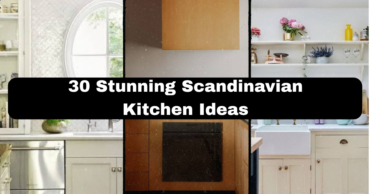
If you’re hunting for 30 Stunning Scandinavian Kitchen Ideas that actually work in real homes, not just in glossy magazines, you’ve landed in the right spot. I’ve dug through design trends, talked to folks who’ve renovated their kitchens, and pulled together the ideas that keep showing up in the best-looking spaces. This isn’t a fluff piece. It’s the real list.
Scandinavian kitchen design refers to a Nordic-inspired style built on light colors, natural materials, and clean lines. The style prioritizes function over decoration, uses wood, white, and muted tones as its base, and avoids clutter. It originated in Denmark, Norway, Sweden, and Finland during the mid-20th century.
Stick around, because I’m about to walk you through everything from paint colors to countertop materials, plus a few tables that make shopping decisions way easier.
What Makes a Kitchen “Scandinavian” Anyway?
Here’s the thing about Scandinavian style. It’s not just white walls and IKEA cabinets. It’s a whole mindset. Nordic countries deal with long, dark winters, so their design leans hard into maximizing light and warmth. Think big windows, pale walls, and wood tones that feel cozy instead of cold. There’s also a strong “less is more” attitude. You won’t find fifteen decorative items cluttering a counter. Everything has a purpose. When I think Scandinavian kitchen, I picture calm, uncluttered spaces where every object earns its spot. It’s minimalist, but never boring, because texture and natural materials do all the heavy lifting.
White walls are the backbone of almost every Scandinavian kitchen I’ve seen. They bounce light around the room and make everything feel bigger. Go for a warm white instead of a stark, clinical one. Warm whites keep the space feeling inviting instead of sterile.
Practical tip: try a paint with slight cream or beige undertones, like an off-white with a warmth rating of 90+ on the Kelvin scale for interior paints.
This works in almost any home style, from farmhouse to modern minimalist, since white is basically a neutral canvas that plays well with everything.
Once your walls are set, it’s time to think about what goes against them, and that’s where wood comes in.
Light wood cabinets, think ash, birch, or pale oak, are a Scandinavian signature. They add warmth without feeling heavy. Unlike dark wood, which can make a small kitchen feel boxed in, light wood keeps things airy.
Actionable tip: if full cabinet replacement isn’t in budget, refinish existing cabinets with a light wood veneer or whitewash stain.
Traditional homes can lean into oak grain details, while modern spaces might prefer flat-panel birch for a sleeker look.
Wood cabinets pair beautifully with open shelving, which brings us to the next idea.
Open shelves are a Scandinavian favorite because they show off everyday items instead of hiding them behind doors. Stack plates, line up glass jars, or display a few plants. It keeps things functional and pretty at the same time.
Tip: keep only items you use weekly on open shelves. Anything decorative-only creates clutter, which fights the whole point of the style.
This idea shines in coastal and farmhouse kitchens too, since both styles value that “everything has its place” charm.
Now let’s talk finishes, because hardware and fixtures matter more than people think.
A Scandinavian kitchen isn’t all whites and wood. You need a little contrast to keep it from feeling flat. Matte black cabinet pulls, faucets, or pendant light fixtures do exactly that. They add a small pop of drama without disrupting the calm vibe.
Tip: stick to one metal finish throughout the kitchen so things feel intentional instead of mismatched.
Industrial and modern farmhouse kitchens also love this black-on-white contrast trick.
Speaking of fixtures, lighting deserves its own spotlight next.
Scandinavian lighting favors clean shapes, think globe pendants, simple dome shades, or thin metal frames. Avoid anything ornate or heavily decorated. The goal is function first, style second.
Practical tip: hang pendants 28 to 34 inches above a kitchen island for the right visual balance.
This lighting style also works great in mid-century modern and Japandi kitchens, since both share that same love of simplicity.
Good lighting needs a good floor to bounce off, so let’s head there next.
Flooring in a Scandinavian kitchen usually mimics the cabinets: pale, natural, and warm. Wide-plank light oak or whitewashed floors are common. They make small kitchens feel bigger and tie the whole room together.
Tip: choose matte-finish flooring over glossy. Matte hides scuffs better and feels more true to the natural Nordic look.
This flooring choice adapts easily to cottage-core and coastal kitchens too, since light floors are basically universal crowd-pleasers.
Next, let’s talk about what goes on your walls behind the stove.
Scandinavian backsplashes skip the bold patterns. Instead, think plain white subway tile, simple square tiles, or even a continuation of the countertop material. Texture matters more than color here.
Tip: try a handmade-look ceramic tile with slight texture variation for subtle visual interest without loud pattern.
This idea flexes well for modern farmhouse kitchens, which also favor understated backsplashes.
Now that walls and floors are handled, let’s look at a bolder color option some people forget about.
Not every Scandinavian kitchen sticks to white and wood only. Muted sage green cabinets are a growing favorite. They bring in color while staying calm and earthy, which fits the Nordic love of nature.
Tip: pair sage cabinets with brass or unlacquered hardware for a soft, elegant contrast.
This color choice adapts beautifully to cottage and traditional kitchens, since sage feels timeless rather than trendy.
Color leads naturally into texture, so let’s talk woven materials next.
A runner rug in a woven jute or wool blend adds warmth underfoot and softens all those hard surfaces. Baskets for produce or towels do double duty as storage and decor.
Tip: choose washable rugs for kitchen use since spills are inevitable.
Boho and coastal kitchens also lean on woven textures, so this idea travels well beyond Scandinavian spaces.
Heavy curtains block light, and light is everything in Scandinavian design. Most Nordic kitchens skip curtains entirely or use sheer, simple linen panels instead.
Tip: if privacy is a concern, try frosted glass film instead of curtains to keep light flowing.
This bare-window approach also fits modern and minimalist kitchens perfectly, since both styles prioritize openness.
Now let’s get into cabinet color combos, because two-tone cabinetry is having a real moment.
Pairing upper white cabinets with lower wood or colored cabinets adds visual interest without overwhelming the space. It’s a subtle way to introduce contrast.
Tip: keep the lighter tone on top to maintain that airy, open feeling Scandinavian kitchens are known for.
Transitional and modern farmhouse kitchens both borrow this two-tone trick often.
Budget Tiers for a Scandinavian Kitchen Refresh
Budget Tier
What’s Included
Estimated Cost
Low
Paint, new hardware, open shelving, textiles
$500-$2,000
Mid
Cabinet refacing, new backsplash, lighting update
$5,000-$12,000
High
Full cabinet replacement, countertop swap, flooring
$15,000-$35,000+
Luxury
Custom cabinetry, stone counters, smart appliances
Push-to-open cabinets and drawers keep the kitchen looking seamless. No hardware means fewer visual interruptions, which supports that clean Nordic look.
Tip: handleless systems cost more upfront but reduce visual clutter dramatically, worth it if budget allows.
Modern and minimalist kitchens use this same trick constantly.
Let’s talk about what to actually put on display once storage is sorted.
Instead of hiding dishware, Scandinavian kitchens often show off simple stoneware mugs, bowls, and plates on open shelves or in glass cabinets. Neutral tones like cream, gray, and terracotta work best.
Tip: group items by color for a curated, intentional look rather than a jumbled one.
Coastal and Japandi kitchens borrow this display habit too.
Now, let’s bring some living things into the space.
A few pots of basil, mint, or rosemary on a windowsill bring life into the kitchen and tie back to that Nordic love of nature. Plus, fresh herbs are genuinely useful for cooking.
Tip: choose a sunny spot with at least 4-6 hours of light daily for herb health.
This idea fits nearly every design style, from boho to traditional, since plants are basically universal.
A well-lit Scandinavian kitchen uses multiple light sources, task lighting under cabinets, ambient overhead lights, and a statement pendant, rather than one single overhead fixture.
Tip: install lighting on separate dimmer switches so you can adjust mood and function independently.
This layered lighting approach works in literally every kitchen style, since good lighting is never a bad idea.
Tips for Success
Start with the biggest surfaces first (walls, floors, cabinets) before adding small decor touches.
Don’t buy everything at once. Scandinavian style looks better when it evolves slowly.
Prioritize natural materials like wood, stone, and wool over synthetic alternatives.
Keep countertops mostly clear. Empty space is part of the design, not a mistake.
Test paint colors on your actual wall before committing, since lighting changes everything.
Mix textures intentionally so the room doesn’t feel flat or one-note.
Invest in a few quality pieces rather than lots of cheap ones.
Common Mistakes and How to Avoid Them
Overloading the space with decor
: Keep surfaces mostly clear. Choose a few meaningful items instead of many small ones.
Choosing stark, cold white instead of warm white
: Test paint swatches in your kitchen’s actual lighting before painting the whole room.
Mixing too many wood tones
: Stick to one or two complementary wood tones throughout the kitchen for cohesion.
Skipping texture entirely
: Add rugs, woven baskets, or linen textiles to avoid a flat, sterile look.
Using heavy, ornate light fixtures
: Choose simple, clean-lined fixtures that match the minimalist Nordic aesthetic.
Ignoring functional storage needs
: Balance open shelving with closed storage so the kitchen stays both pretty and practical.
Similar Variations
Japandi Kitchen – A blend of Japanese minimalism and Scandinavian warmth, using dark wood accents with light backgrounds.
Coastal Scandinavian – Adds beachy blues and weathered wood tones to the classic Nordic base.
Modern Farmhouse Nordic – Combines rustic farmhouse elements like shiplap with Scandinavian simplicity.
Danish Hygge Kitchen – Focuses heavily on coziness, soft textiles, and warm lighting over strict minimalism.
Nordic Industrial – Mixes raw materials like concrete and metal with the light, airy Scandinavian palette.
Swedish Gustavian – A more traditional, ornate take on Scandinavian design with pale painted furniture and classic detailing.
Putting together a Scandinavian kitchen really comes down to a few core habits: keep it light, keep it natural, and keep it simple. You don’t need to change everything overnight. Start with paint or hardware, then build from there. Whether you go full white-and-wood or add a bold sage accent wall, the heart of the style stays the same: calm, functional spaces that feel good to be in every single day. I hope this list of 30 Stunning Scandinavian Kitchen Ideas gave you a clear, doable roadmap for your own kitchen refresh.
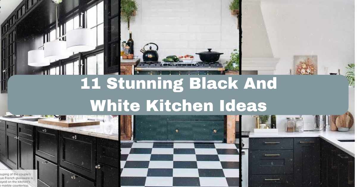
I’ve pulled together 11 Stunning Black And White Kitchen Ideas that actually work in real homes, not just in magazine spreads where nobody cooks. If you’ve ever stared at your kitchen and felt like it needed something but couldn’t put your finger on what, stick with me here.
A black and white kitchen is a design scheme that pairs the two colors (often with wood, brass, or gray accents) to create high contrast, timeless style, and visual balance. It works because black grounds a space while white keeps it bright, and neither color goes out of fashion.
By the time you finish reading, you’ll have more ideas than you know what to do with, plus some real talk about what mistakes to dodge along the way.
What Makes Black And White Kitchens So Popular
Here’s the thing about black and white kitchens: they’re basically the little black dress of home design. You can dress them up, dress them down, and they never really go out of style. I think that’s why so many people gravitate toward this combo when they’re planning a remodel. It’s safe, but it doesn’t feel boring.
There’s also something satisfying about the contrast. White keeps things feeling open and clean. Black adds weight and drama so the room doesn’t feel flat. Together, they create a kind of visual rhythm that your eye just enjoys looking at. And because it’s a neutral palette at its core, you can swap in colorful accents whenever you want a change without redoing the whole room.
Go Bold With Black Lower Cabinets And White Uppers
This is probably the most popular way to do a black and white kitchen right now, and for good reason. Black lower cabinets ground the room and hide scuffs way better than white ones do. White upper cabinets keep the space feeling light and airy, especially if you’ve got low ceilings or a smaller kitchen.
I like this combo because it splits the visual weight in a smart way. Your eyes don’t feel like they’re being pulled down by an all-black room or blinded by an all-white one.
Practical tip: Stick with a satin or matte black finish on the lower cabinets. Glossy black shows fingerprints and water spots like crazy.
This look adapts beautifully to modern farmhouse, transitional, and even coastal kitchens if you swap in light wood floors.
Speaking of floors, let’s talk about how flooring choices can make or break this whole look.
Checkerboard floors in black and white tile bring an instant diner-meets-chic vibe. It sounds like a big commitment, but honestly, it’s one of the easiest ways to add pattern without touching a single cabinet or wall.
You can go classic with a 12×12 tile grid, or get playful with elongated rectangular tiles set on a diagonal. Either way, this floor becomes the star of the room, so keep your cabinets and walls simple.
Practical tip: Use matte finish tile instead of glossy. It hides scratches better and won’t turn into a slip hazard when wet.
This idea works great in retro, mid-century modern, and even farmhouse kitchens. It’s less common in strict minimalist or coastal spaces, but I’ve seen it pulled off there too with the right restraint.
Now let’s move from the floor up to something that touches every part of your kitchen: the walls.
An all-white kitchen can start to feel a little flat after a while. One fix I really love is painting a single wall (or even just the space behind open shelves) in matte black. It creates instant depth and makes your dishes, plants, or cookbooks pop against the dark backdrop.
This works especially well in kitchens with lots of natural light, because the black won’t make the room feel cave-like. If your kitchen is dim already, maybe skip this one or pair it with strong task lighting.
Practical tip: Paint the wall in a matte or eggshell finish, not satin or gloss, so it doesn’t reflect too much light and look patchy.
This idea adapts well to industrial, modern, and Scandinavian kitchens. It’s a great low-cost trick if you’re not ready for a full renovation.
Black And White Color Palette Combinations
Combo Name
Main Colors
Best Accent
Style Vibe
Classic Contrast
Pure black + pure white
Brushed nickel
Modern, minimalist
Warm Monochrome
Charcoal + cream
Brass or gold
Traditional, transitional
Soft Statement
Matte black + off-white
Natural wood
Scandinavian, farmhouse
Bold Graphic
Black + white + gray stripe
Matte black hardware
Industrial, contemporary
Coastal Twist
Navy-black + white
Rattan and light oak
Coastal, cottage
Once your walls and floors are sorted, it’s time to think about the hardware and fixtures that tie it all together.
If your kitchen already has white cabinets and countertops, matte black fixtures are an easy way to add contrast without repainting anything. Faucets, cabinet pulls, and even light fixtures in matte black instantly modernize a space.
I’ve done this in my own kitchen and it made a bigger difference than I expected. Suddenly the whole room looked more intentional, like someone actually planned it instead of just picking whatever was on sale.
Practical tip: Match the finish across all your hardware. Mixing matte black with shiny black chrome pieces looks unfinished, not eclectic.
This works in nearly every style, from modern farmhouse to industrial loft kitchens. It’s one of the cheapest updates on this whole list, honestly.
Let’s talk countertops next, since they take up a huge amount of visual space in any kitchen.
Countertops are a big investment, so you want something that photographs well and holds up to daily abuse. White quartz with black or gray veining gives you that marble look without the maintenance nightmare real marble brings.
This countertop choice pulls the black and white theme together in a way that feels natural, not forced. It also gives your eye something interesting to look at without being loud.
Practical tip: Ask for a large slab sample before you commit. Veining patterns vary a lot between slabs, and photos online don’t always match what shows up at your house.
This countertop style fits modern, traditional, and transitional kitchens equally well. It’s a safer bet than trend-driven materials if you plan to sell your home eventually.
Now that your surfaces are sorted, let’s get into some smaller design choices that make a bigger impact than you’d think.
Hang A Statement Black Pendant Light Over The Island
Lighting fixtures do double duty. They light your space, and they act like jewelry for the room. A black pendant light (or a cluster of three) hanging over your kitchen island adds drama without taking up any floor space.
I always tell people that lighting is the easiest thing to change if you’re scared of commitment. You can swap a pendant light out in an afternoon.
Practical tip: Hang pendants about 30 to 36 inches above the island countertop for the best mix of function and looks.
This idea works in modern, industrial, farmhouse, and even glam kitchens depending on the shape you pick.
Let’s move on to something that a lot of people overlook: the backsplash.
Install A White Subway Tile Backsplash With Black Grout
This one surprises people. Instead of the usual white grout, try black grout with your white subway tile. It highlights the tile pattern in a way that regular grout just can’t do. It’s a small detail, but it changes the whole feel of the backsplash.
I think this is one of those “why didn’t I think of that” ideas once you see it in person. It adds graphic interest without introducing a new color or pattern.
Practical tip: Use black epoxy grout instead of standard black grout. Epoxy resists staining way better over time in a kitchen environment.
This style fits farmhouse, industrial, and transitional kitchens especially well.
Budget Tiers For Black And White Kitchen Updates
Budget Level
What You Can Do
Approximate Cost Range
Low ($200-$800)
Paint accent wall, swap hardware, new light fixture
$200-$800
Mid ($1,500-$5,000)
New backsplash, countertop resurfacing, cabinet painting
$1,500-$5,000
High ($8,000-$20,000+)
Full cabinet replacement, new flooring, custom island
$8,000-$20,000+
With your budget in mind, let’s look at a few more design moves that don’t cost a fortune but pack a visual punch.
Black and white kitchens can start to feel cold or sterile if you’re not careful. The fix is texture. Woven baskets, rattan bar stools, jute rugs, and linen curtains all add warmth without introducing new colors that clash with your scheme.
I always recommend this step to people who tell me their all-black-and-white kitchen feels “off” somehow. Usually it’s missing texture, not color.
Practical tip: Add at least three different textures (like woven, wood, and metal) to keep the room from feeling flat.
This works especially well in coastal, boho, and Scandinavian-style kitchens, but honestly it helps any black and white space feel less like a showroom.
Next, let’s talk about a design trick that a lot of smaller kitchens really need.
If you’re doing any kind of renovation that touches your windows, consider black window frames instead of white. They create a graphic grid effect against the outside view and tie in beautifully with black cabinets or fixtures inside.
This is a bit of a bigger investment since you’re dealing with actual window replacement, but the payoff is huge in terms of style. It’s the kind of detail that makes people ask who your designer was.
Practical tip: If full replacement isn’t in the budget, look into black window film or trim kits that mimic the look for way less money.
This idea shines in modern, industrial, and farmhouse kitchens with lots of natural light.
Let’s shift gears now and talk about smaller decorative touches that finish the room off.
Display Black And White Cookbooks And Dishware Openly
Open shelving gives you a chance to show off curated black and white dishware, cookbooks, and small appliances. It’s a low-cost styling trick that reinforces your color scheme without any construction involved.
I like mixing matte black plates with white ceramic bowls on open shelves. It looks intentional and gives the eye a break from closed cabinet doors.
Practical tip: Keep groupings odd-numbered (three or five items) since that tends to look more balanced than even groupings.
This trick works in almost any kitchen style, though it shines especially in farmhouse and Scandinavian spaces where open shelving is already common.
Now let’s cover one more idea that ties the whole kitchen together from top to bottom.
Add A Black Range Hood As The Kitchen’s Focal Point
Your range hood doesn’t have to blend in. A black range hood, especially one with a bold shape like a curved or angular design, becomes the anchor point for your whole kitchen. Everything else can support it instead of competing with it.
This is a great option if you have white cabinets and want one strong black element without going overboard on dark tones throughout the room.
Practical tip: Choose a hood with a matte or powder-coated finish so it doesn’t show grease splatters as easily as a glossy one would.
This idea fits modern, industrial, and transitional kitchens particularly well.
Tips For Success
Test paint and cabinet colors in your actual kitchen lighting before committing. Store lighting always looks different at home.
Keep at least 60% of the room in white or light tones so the black doesn’t overwhelm the space.
Mix matte and glossy finishes so the room has some visual depth instead of looking flat.
Bring in warm metals like brass or wood tones to keep the kitchen from feeling too stark.
Clean black surfaces with a microfiber cloth to avoid streaking, especially on matte black cabinets.
Add plants or greenery. They’re the easiest way to soften a high-contrast room.
Don’t rush the hardware decision. It’s a small detail that gets touched every single day.
Common Mistakes And How To Avoid Them
Going all black with no white balance
: This makes a kitchen feel small and dark. Keep white as your dominant color and use black as the accent.
Mixing too many black finishes
: Matte black, glossy black, and black chrome all look different up close. Stick to one finish family for hardware and fixtures.
Skipping texture entirely
: An all smooth, all hard-surface black and white kitchen feels cold. Add wood, woven baskets, or textiles to warm it up.
Choosing glossy black cabinets in a busy kitchen
: Glossy black shows every fingerprint and smudge. Go matte or satin if the kitchen sees a lot of daily use.
Ignoring lighting needs
: Dark cabinets absorb light, so you may need more fixtures than you think. Add under-cabinet lighting to compensate.
Forgetting resale value
: Extremely bold, trend-heavy choices can turn off future buyers. Balance bold elements with timeless choices like quartz countertops.
Similar Variations
Modern Farmhouse Black And White: Mixes shiplap, black hardware, and white cabinets for a cozy but graphic look.
Industrial Black And White: Leans into exposed brick, black steel shelving, and metal light fixtures.
Scandinavian Monochrome: Softer black and white palette with lots of light wood and minimal decor.
Coastal Black And White: Swaps pure black for navy-black tones and adds rattan, linen, and light oak accents.
Art Deco Black And White: Adds geometric tile patterns, brass fixtures, and glossy finishes for a glam feel.
Transitional Black And White: Blends traditional cabinet shapes with modern black hardware for a timeless middle ground.
At the end of the day, a black and white kitchen gives you a flexible base that works with almost any style you already love. Whether you go bold with checkerboard floors or keep it subtle with black hardware and a white quartz counter, the combination holds up over time in a way a lot of trendy color schemes just don’t. I hope this list of 11 Stunning Black And White Kitchen Ideas gave you enough inspiration to finally make a decision on your own kitchen.
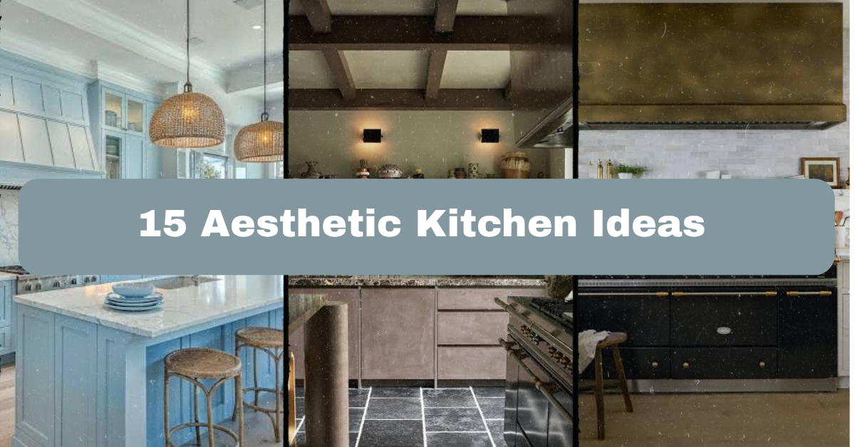
I’ve spent way too many hours scrolling through kitchen photos, and I think I finally cracked the code on what makes a kitchen look good instead of just looking “fine,” so let me walk you through 30 aesthetic kitchen ideas that actually work in real homes, not just magazine spreads.
An aesthetic kitchen is a cooking space designed with intentional style choices, cohesive colors, textures, and layout, that create visual harmony while staying functional. The goal is a room that feels good to look at and easy to work in every single day.
Stick around, because I’m about to break down everything from paint colors to tiny decor tricks that designers don’t always tell you about.
What Makes a Kitchen “Aesthetic” Anyway?
Okay, real talk. “Aesthetic” gets thrown around a lot, but here’s what it actually means for a kitchen. It’s not about spending a fortune or gutting your whole space. It’s about making choices on purpose instead of by accident. Think about the last kitchen that made you stop and stare. It probably had a color story that made sense, some texture you wanted to touch, and stuff on the counters that looked chosen, not just left there. That’s it. That’s the whole secret. You’re not trying to build a showroom. You’re trying to build a room that feels like “you,” but polished. Once you get that mindset, the ideas below will make a lot more sense.
Your kitchen needs a color story, meaning three to five colors that repeat throughout the space. Think cabinet color, wall color, backsplash tone, and one accent color for things like bar stools or a rug. When colors repeat, your eye reads the room as calm and put together.
Practical tip: grab paint chips and hold them next to your countertop and flooring before committing. Lighting changes everything.
This works in every style. Coastal kitchens might use soft blues and sandy whites. Farmhouse leans warm white and black. Moody modern goes deep green or navy with brass. Once your palette is locked, the next step is figuring out where color actually lives in the room.
A backsplash is basically free real estate for personality. Zellige tile, hand-painted patterns, or even a slab of marble running up the wall can turn a plain kitchen into something people photograph.
I’d say don’t be scared of pattern here, even if your cabinets are simple. A busy backsplash with plain cabinets looks intentional. Busy everything looks chaotic.
Practical tip: order physical tile samples, not just photos online, since tile color shifts a lot under different lighting.
Traditional kitchens do well with classic subway tile in herringbone. Modern kitchens love large-format slab backsplashes with almost no grout lines. Once your backsplash is set, your cabinet hardware needs to match that same energy.
Cabinet hardware is small but mighty. Changing knobs and pulls is one of the cheapest upgrades that makes the biggest visual difference, hands down.
Brass, matte black, and unlacquered bronze are huge right now because they age nicely and add warmth. Skip the shiny chrome unless your whole kitchen is intentionally sleek and modern.
Practical tip: measure your existing hole spacing before shopping so you don’t end up drilling new holes into your cabinets.
Traditional kitchens love ornate pulls. Minimalist kitchens often go handleless with push-to-open cabinets. Speaking of cabinets, let’s talk about what’s happening on top of them.
Open shelves let you show off pretty dishes, plants, and cookbooks instead of hiding everything behind doors. It’s an easy way to add personality without touching a single wall.
The trick is styling it right. Group items in odd numbers, mix heights, and leave breathing room. Overpacked shelves look cluttered fast.
Practical tip: only display things you actually use often, since open shelves collect grease and dust if items just sit there forever.
Farmhouse kitchens pair open shelving with wood brackets. Modern kitchens use floating shelves with hidden hardware for a cleaner look. Now let’s zoom out and talk about the overall cabinet color trend that’s taking over.
Two-tone cabinets mean your upper and lower cabinets are different colors. Usually the bottom is darker and heavier looking, while the top is lighter to keep the room from feeling boxed in.
This trick works so well because it adds depth without adding clutter. Your eye naturally splits the room into layers, which feels more designed.
Practical tip: keep the darker tone below eye level and lighter tones up top, since flipping it can make a kitchen feel top-heavy.
Modern kitchens go black and white. Coastal kitchens might pair navy lowers with white uppers. Once your cabinet colors are settled, think about what’s covering your floor.
Flooring sets the tone before anyone even notices the cabinets. Wide-plank wood, patterned tile, or large-format stone-look porcelain all bring different vibes to a kitchen.
Patterned tile floors, especially checkerboard or Moroccan-inspired designs, are having a huge moment right now. They add personality to an otherwise neutral kitchen.
Practical tip: if you’re nervous about pattern, use it just in a small area like near the sink or in a butler’s pantry, so it stays a feature instead of overwhelming the space.
Traditional and Mediterranean kitchens love patterned tile. Modern kitchens tend to stick with wide plank wood or polished concrete. Speaking of grounding a room, lighting does a lot of that work too.
One overhead light is not going to cut it for an aesthetic kitchen. You want at least three layers: ambient light from the ceiling, task lighting under cabinets, and a statement fixture over the island.
Pendant lights over an island are basically the jewelry of the kitchen. They’re small, but they draw the eye and set the style tone instantly.
Practical tip: hang pendants 30 to 36 inches above the counter for the best mix of function and looks.
Traditional kitchens might choose lantern-style pendants. Modern spaces lean toward sculptural glass or matte black fixtures. Now let’s talk about the island itself, since it’s often the heart of the room.
Your island can be a totally different color or material than the rest of your cabinets. This is one of the easiest ways to create a focal point without redoing the whole kitchen.
A wood island in an all-white kitchen feels warm and grounded. A colorful island in a neutral kitchen feels playful and fresh.
Practical tip: leave at least 36 inches of clearance around your island so people can move comfortably, especially if you’re adding stools.
Farmhouse kitchens love a butcher block island top. Modern kitchens often use waterfall-edge quartz or marble. Now that the island is sorted, let’s talk seating.
Bar stools are functional furniture, sure, but they’re also a chance to add texture. Woven rattan, leather, or boucle fabric stools bring in softness that balances out all the hard surfaces in a kitchen.
Mixing materials here, like a wood seat with metal legs, keeps things from feeling too matchy.
Practical tip: leave about 12 inches between stools so people aren’t bumping elbows while eating.
Coastal kitchens love woven rattan stools. Modern kitchens often go for sleek leather or molded plastic seats. Let’s move from seating to something people forget entirely: the ceiling.
Most people paint their ceiling white and call it done. But a colored ceiling, wood beams, or even wallpaper up top can completely change how a kitchen feels.
A dark ceiling makes a room feel cozy and intimate. Exposed wood beams add rustic charm without much effort if your kitchen already has good bones.
Practical tip: if you’re nervous about color overhead, try painting just the ceiling in the same color as your trim for subtle depth.
Farmhouse and cottage kitchens love exposed beams. Modern kitchens sometimes go for a glossy black ceiling for drama. Let’s shift gears and talk about window treatments now.
Kitchen windows need treatments that handle grease and steam but still look soft. Café curtains, roman shades, or simple woven wood blinds all work great.
Skip heavy drapes near the stove. They’re a fire hazard and honestly just get gross fast from cooking splatter.
Practical tip: choose washable fabric or wipeable materials for anything near your cooking area.
Coastal kitchens love light linen café curtains. Traditional kitchens might use classic roman shades in a small print. Now let’s talk about something a lot of people skip: the ceiling’s best friend, the walls.
Budget Tiers for a Kitchen Refresh
Budget Level
What You Can Realistically Do
Estimated Cost Range
Small ($200-$800)
New hardware, paint, open shelving, new light fixture
$200 – $800
Medium ($1,500-$5,000)
Backsplash redo, new countertops, cabinet repaint
$1,500 – $5,000
Large ($8,000-$20,000)
New cabinets, flooring, island build, full lighting overhaul
Wallpaper isn’t just for living rooms anymore. A small accent wall, the inside of open shelving, or even a ceiling can handle a bold pattern without overwhelming the whole kitchen.
Look for washable, kitchen-rated wallpaper since grease and steam will find their way onto every surface eventually.
Practical tip: wallpaper the inside back panel of open shelves for a pop of pattern that’s basically zero maintenance since it’s not touching food or hands.
Traditional kitchens love floral or toile patterns. Modern kitchens might choose geometric or abstract prints instead. Now, let’s talk about plants, because a kitchen without any greenery just feels a little cold to me.
13. Bring in Greenery That Can Handle Kitchen Life
Plants soften hard surfaces and add life to a room full of counters and appliances. Herbs on the windowsill, a trailing pothos on top of cabinets, or a big leafy plant in the corner all work.
Practical tip: pick plants that tolerate low humidity swings and occasional neglect, like pothos, snake plants, or rosemary, since kitchens go through temperature changes fast.
Farmhouse kitchens love a row of potted herbs near the sink. Modern kitchens might do one large sculptural plant instead of many small ones. Speaking of small details, let’s talk about the often-overlooked kitchen rug.
A rug in the kitchen anchors the space and adds color right at ground level. Runners work great in front of the sink or stove, while a larger rug can define the whole island area.
Practical tip: choose flat-weave or washable rugs since kitchen rugs deal with spills constantly.
Coastal kitchens love jute runners. Modern kitchens might use a bold graphic pattern rug for contrast against plain flooring. Now let’s wrap up the design ideas with one more that ties everything together.
15. Style Your Counters Like You’d Style a Bookshelf
Empty counters can look cold, but cluttered counters look messy. The sweet spot is styling with a few intentional objects: a wood cutting board leaned against the backsplash, a ceramic vase, a bowl of fruit.
Practical tip: stick to the “rule of three,” grouping items in small odd-numbered clusters for a balanced, natural look.
Traditional kitchens love ceramic canisters and cookbook stands. Modern kitchens keep it minimal with just one or two sculptural objects. That wraps up the design ideas, but let’s make sure you actually pull them off well.
Tips for Success
Start with lighting and color before buying any furniture or decor, since those two things affect everything else in the room.
Test paint and tile samples in your actual kitchen lighting at different times of day before committing.
Mix at least two textures, like wood and metal or stone and fabric, so the room doesn’t feel flat.
Keep a consistent hardware finish throughout the kitchen unless you’re intentionally going for a mixed-metal look.
Leave some negative space on counters and shelves. Not every inch needs decor.
Shop secondhand for stools, light fixtures, or accessories to save money while adding character.
Take a photo of your kitchen before making changes so you can actually see your progress, since it’s easy to lose perspective when you’re staring at the same room every day.
Common Mistakes and How to Avoid Them
Ignoring scale
: Buying a tiny pendant light for a huge island or a giant rug for a small floor throws off the whole room. Measure twice before buying anything.
Matching everything too perfectly
: A kitchen where every single metal finish and wood tone matches exactly feels stiff and showroom-like. Mix finishes slightly for a lived-in feel.
Overcrowding open shelves
: Piling too much onto open shelving makes a kitchen feel cluttered, not curated. Edit down to your favorite pieces only.
Skipping task lighting
: Relying only on a pretty overhead fixture leaves you cooking in your own shadow. Add under-cabinet lights for actual function.
Choosing trendy over durable
: Picking materials purely because they’re popular right now, without checking if they hold up to daily kitchen use, leads to regret. Always check maintenance needs first.
Forgetting the ceiling and floor
: Focusing all your design energy on cabinets while ignoring the ceiling and floor leaves the room feeling unfinished. Treat all six surfaces of the room as part of the design.
Similar Variations
Coastal Kitchen – light woods, blue and white palettes, and woven textures for a beachy, breezy feel.
Farmhouse Kitchen – white cabinets, black hardware, shiplap, and butcher block for a cozy, rustic vibe.
Japandi Kitchen – a mix of Japanese minimalism and Scandinavian warmth, using natural wood and clean lines.
Moody Modern Kitchen – dark cabinets, brass accents, and dramatic lighting for a bold, sophisticated look.
Cottagecore Kitchen – vintage details, floral patterns, and lots of greenery for a whimsical, homey feel.
Industrial Kitchen – exposed brick, black metal fixtures, and concrete surfaces for an edgy, urban look.
I know that’s a lot to take in, but you don’t have to do all 30 things at once. Pick a few that actually match how you live and start there. Small changes, like new hardware or a styled shelf, add up faster than you’d think, and before long your kitchen will feel like it belongs in one of those photos you’ve been saving, all thanks to these 30 aesthetic kitchen ideas.
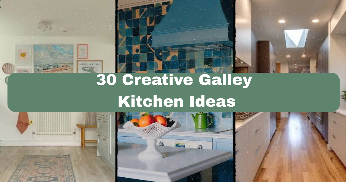
I’ve spent years digging through kitchen renovations, and I can tell you that these 30 creative galley kitchen ideas cover more ground than almost anything else you’ll find on the topic. If you’re stuck staring at two parallel walls wondering how to make them work, you’re in the right place.
A galley kitchen is a narrow cooking space with counters and cabinets running along two parallel walls, usually with a walkway in between. The best designs use smart storage, light colors, and open shelving to make the space feel bigger and function better despite tight square footage.
I’m going to walk you through everything from color tricks to storage hacks, and by the end, you’ll have a real plan instead of just a Pinterest board full of maybes.
What Makes a Galley Kitchen Different Anyway?
So here’s the thing about galley kitchens. They got their name from ship galleys, those tiny cooking spaces on boats where every inch had to earn its keep. Your kitchen probably isn’t on a boat, but it faces the same challenge. Two walls, a narrow path between them, and zero room for waste.
I actually love this layout once you understand it. There’s no wasted movement. Everything is close. The trick isn’t fighting the shape, it’s working with it. Once you stop trying to make it look like a sprawling open kitchen and start leaning into the narrow, efficient vibe, things click. That mindset shift is honestly the first step before any of these ideas will work for you.
Here’s a rule I swear by: keep both walls the exact same shade. When one wall is darker or busier than the other, your eye stops and the hallway feels choppy. Stick to soft whites, warm creams, or pale greige on cabinets and walls alike.
Actionable tip: test your paint color at both the darkest and brightest times of day before committing, since narrow spaces amplify shadows.
This works in almost any style. Coastal kitchens love a soft white-on-white look, while traditional homes might lean toward a creamy butter tone. Once your walls are unified, you can start thinking about how light bounces around the room, which brings us to reflective surfaces.
2. Add Glossy Backsplash Tile to Bounce Light Around
Matte surfaces soak up light. Glossy ones throw it back into the room. In a galley kitchen, that difference matters a lot because you usually only have one window, if you’re lucky.
I always tell people to pick a subway tile or a small mosaic in a glossy finish. It doesn’t need to be flashy, just reflective. Even a plain white glossy tile can make a huge difference compared to a chalky matte one.
Practical tip: install under-cabinet lighting above the backsplash so it catches that shine both day and night.
Modern kitchens might use glass tile in a herringbone pattern, while farmhouse styles could use a classic subway look. Once your walls are glowing, it’s time to think about what’s hanging above your counters.
This one scares people at first, but hear me out. Removing even a few upper cabinets and replacing them with open shelves makes a galley kitchen feel less boxed in immediately. You lose some hidden storage, sure, but you gain visual breathing room.
I like mixing wood shelves with white walls for warmth. Stack plates, group mugs, add a small plant. It doesn’t need to be perfect, just tidy enough that it reads as intentional.
Tip: keep shelf styling to odd numbers of objects, like three or five items per grouping, since it looks more natural than pairs.
This idea flexes easily. Industrial kitchens might use black metal brackets, while cottage kitchens go for distressed wood. Speaking of storage, let’s talk about what happens below the counter.
4. Choose Pull-Out Drawers Instead of Deep Cabinets
Deep base cabinets in a galley kitchen are storage black holes. You shove something in the back and never see it again. Pull-out drawers fix that completely because you can see and reach everything without kneeling on the floor digging around.
I recommend prioritizing pull-outs near your stove and sink first, since those areas get used the most. Even converting just two or three cabinets can transform how efficient your kitchen feels.
Quick tip: measure your cabinet depth before ordering pull-out kits, since older homes sometimes have nonstandard cabinet sizes.
This works no matter your style since it’s hidden functionality. Nobody sees the drawers, they just notice the kitchen works better. Now let’s talk about something people always forget: the floor.
Storage Solution Comparison Table
Storage Type
Best For
Approx. Cost
Space Saved
Pull-out drawers
Pots, pans, dry goods
$150-$400 per cabinet
Moderate
Vertical dividers
Baking sheets, trays
$30-$80
Low
Corner carousel
Awkward corner cabinets
$200-$500
High
Over-the-sink shelf
Sponges, soap
$20-$60
Low
Toe-kick drawers
Rarely used items
$100-$250
Moderate
5. Use a Continuous Flooring Material Without Breaks
One mistake I see constantly is switching flooring materials halfway through a galley kitchen, like tile near the stove and wood near the sink. It chops the room visually and makes it feel smaller than it is.
Pick one material and run it the entire length of the kitchen. Wide plank wood, large format tile, or polished concrete all work great because the eye doesn’t stop to process a transition.
Tip: choose flooring that runs lengthwise down the galley, not across it, since it visually stretches the room.
Farmhouse kitchens love wide plank wood, while modern spaces often go for polished concrete or large porcelain tile. Once your floor is settled, let’s think about your sink placement.
6. Install a Single Bowl Sink to Free Up Counter Space
Double bowl sinks eat up counter real estate that galley kitchens simply don’t have to spare. Switching to a single large bowl gives you more usable surface on either side and makes washing big pots way easier too.
I’ve seen kitchens gain almost a foot of usable counter just from this one swap. It’s a small change with a surprisingly big payoff.
Actionable tip: pair your single bowl sink with a roll-up dish rack that fits inside the bowl when not in use, so it disappears completely.
This idea suits basically every style. Farmhouse sinks are deep and single bowl anyway, while modern kitchens often use sleek stainless single basins. Now, let’s talk about something that changes the whole mood: lighting layers.
7. Layer Three Types of Lighting Instead of One Overhead Fixture
A single ceiling light in a galley kitchen creates harsh shadows and dark corners. I always push for three layers: ambient overhead, task lighting under cabinets, and accent lighting somewhere unexpected, like inside glass cabinets.
This layering makes the narrow space feel more like a designed room and less like a hallway that happens to have a stove in it.
Tip: use warm white bulbs (around 2700K to 3000K) throughout so the different light sources don’t clash in tone.
Coastal kitchens might use woven pendant lights, while modern ones lean toward slim LED strips. Speaking of pendants, let’s talk about hanging fixtures specifically.
8. Hang Slim Pendant Lights Instead of a Chandelier
Chandeliers and bulky fixtures hog visual space in a narrow kitchen. Slim pendants, on the other hand, add personality without taking up width. I like using two smaller pendants spaced evenly instead of one big statement piece.
This creates rhythm down the galley and draws the eye along the length of the room, which actually makes it feel longer and more intentional.
Practical tip: hang pendants no lower than 30 inches above the counter to avoid bumping heads while cooking.
Industrial kitchens might use exposed bulb pendants, while traditional spaces prefer glass globe styles. Now let’s shift to something structural: sightlines.
If your galley kitchen dead-ends into a wall, consider opening that end up, even partially. You don’t need a full open floor plan. Just removing a small wall section or adding a pass-through window can make the whole space breathe.
I’ve watched galley kitchens transform completely with this one move because suddenly there’s a view, some natural light, or a connection to another room.
Tip: consult a contractor before removing any wall, since some “non-structural” walls still carry plumbing or electrical lines.
This works in almost every home style, though modern homes tend to go bigger with full openings while traditional homes might prefer a smaller pass-through with trim detail. Next, let’s talk about something easy: hardware.
10. Upgrade Cabinet Hardware to Create a Cohesive Look
Small detail, big impact. Mismatched or dated cabinet hardware makes a galley kitchen feel unfinished, even if everything else is perfect. Swapping to unified pulls and knobs is one of the cheapest upgrades on this entire list.
I recommend brushed brass or matte black depending on your existing fixtures. Consistency matters more than the specific finish you pick.
Tip: measure your existing hardware holes before shopping so you don’t end up drilling new holes into cabinet doors.
Modern kitchens often go matte black, farmhouse leans toward oil-rubbed bronze, and coastal spaces love brushed nickel. Now let’s get into color contrast, which changes everything.
Wait, can you even fit an island in a galley kitchen? Sometimes, yes, if there’s enough width. A slim rolling cart or narrow island adds prep space and can be pushed aside when you need more room to move.
I like choosing a cart in a contrasting color or material, like a butcher block top against white cabinets, to add warmth without permanently committing space.
Tip: measure your walkway width first. You need at least 42 inches of clearance remaining even with the cart in place.
Industrial kitchens might use a metal cart, while cottage styles prefer a wood cart with turned legs. Now, let’s talk about something people overlook completely: ceiling treatment.
Most people paint ceilings white and forget about them. But painting your galley kitchen ceiling a soft color, or even adding a subtle wallpaper, draws the eye up and makes the room feel taller.
I’ve seen pale blue, soft sage, and warm cream ceilings work beautifully in narrow kitchens because they add dimension without competing with your cabinets.
Tip: use a flat or eggshell finish on ceilings to avoid glare from overhead lighting.
Traditional homes might add beadboard paneling on the ceiling, while modern kitchens keep it simple with a single soft tone. Speaking of dimension, let’s talk about mirrors next.
13. Add a Small Mirror or Mirrored Backsplash Section
Mirrors aren’t just for bathrooms. A small mirrored panel at the end of a galley kitchen, especially if it dead-ends into a wall, tricks the eye into thinking the space continues further than it does.
I’ve used mirrored subway tile behind a stove before and it genuinely doubled how open that kitchen felt.
Tip: keep mirrored sections small and strategic, like behind open shelving, rather than covering an entire wall, since too much reflection gets busy fast.
Modern and glam styles love full mirrored backsplashes, while traditional kitchens might use just a framed mirror panel. Now, let’s discuss window treatments.
14. Skip Heavy Curtains and Use Simple Roman Shades
Galley kitchens often have just one small window, and heavy curtains block precious light. Simple roman shades or café curtains let light filter through while still giving you privacy when needed.
I always suggest a light linen or cotton fabric in a neutral tone so it doesn’t compete with your cabinets or backsplash.
Tip: mount shades inside the window frame rather than outside to keep the sightline clean in a tight space.
Coastal kitchens love woven bamboo shades, while modern kitchens might skip window treatments entirely and let the glass stand alone. Let’s move on to something functional: appliance placement.
Standard-depth appliances can eat into your walkway more than you’d think. Slim refrigerators and panel-ready dishwashers that match your cabinetry help the galley kitchen feel seamless instead of cluttered with bulky boxes.
I always tell clients to measure appliance depth, not just width, since depth is what really impacts your walking clearance in a narrow kitchen.
Tip: look for counter-depth refrigerators, which sit flush with your counters instead of sticking out several inches.
Modern kitchens go all in on panel-ready everything, while traditional kitchens might keep stainless steel visible as a design choice. Now, let’s talk texture.
A galley kitchen doesn’t need to be all white to feel open. Mixing in warm wood tones, like a wood island top or open shelving, adds texture without shrinking the space visually, as long as you keep the wood tones consistent with each other.
I like pairing light oak with white cabinets for a Scandinavian feel, or richer walnut tones for something more traditional.
Tip: stick to no more than two wood tones in the same kitchen to avoid visual chaos.
Scandinavian kitchens lean toward pale ash wood, while traditional kitchens often prefer deeper cherry or walnut. Now, let’s talk about something small but mighty: rugs.
A narrow runner rug down the center of your galley kitchen adds color, softens the sound of footsteps, and honestly just makes the space feel more finished. It’s such a simple addition that gets skipped constantly.
I recommend a low-pile rug so it doesn’t create a tripping hazard in a walkway you use constantly throughout the day.
Tip: choose a washable rug material since galley kitchens see a lot of spills and foot traffic in a concentrated area.
Bohemian kitchens might use a vintage-style flatweave rug, while modern kitchens prefer a simple striped runner. Let’s shift to something practical again: appliance garages.
18. Build an Appliance Garage to Hide Countertop Clutter
Countertop space in a galley kitchen is basically gold. An appliance garage, which is a small cabinet with a roll-up or lift-up door, hides your toaster, coffee maker, and blender while keeping counters clear when you’re not using them.
I love this idea because it lets you keep your counters looking clean without actually giving up your appliances or moving them to another room.
Tip: place the appliance garage near an outlet so you’re not stretching cords across your workspace.
Traditional kitchens often build these into corner cabinets, while modern kitchens might use a sleek lift-up panel design instead. Now, let’s talk about a bigger structural idea: removing an upper cabinet run entirely on one side.
19. Remove Uppers on One Wall Entirely for a Lopsided Layout
This sounds unusual, but it works surprisingly well. Removing all upper cabinets from just one wall, and keeping the other wall fully stocked, creates an intentional asymmetry that makes the kitchen feel less like a tunnel.
The bare wall can hold art, a single floating shelf, or just stay clean and painted. It gives your eyes a place to rest.
Tip: keep your most-used items on the wall that still has cabinets, and treat the bare wall as a visual break, not extra storage.
Modern and minimalist kitchens embrace this best, though even traditional kitchens can pull it off with the right trim work. Let’s talk about something more decorative: art placement.
20. Hang Art at the End Wall to Create a Focal Point
If your galley kitchen has a wall at the end, whether it’s a window or a solid wall, treat it like a focal point. A piece of art, a clock, or even open shelving with styled objects gives your eye somewhere to land when you walk in.
I always suggest scaling the art to the wall size. A tiny frame on a big wall gets lost completely.
Tip: hang art at eye level, around 57 to 60 inches from the floor, for the most natural viewing height.
Traditional kitchens might use framed botanical prints, while modern kitchens prefer abstract or graphic pieces. Now, let’s move into something more about layout logic: the work triangle.
21. Respect the Kitchen Work Triangle Even in Tight Spaces
The classic work triangle connects your sink, stove, and fridge in a triangle shape so you’re not walking miles while cooking. In a galley kitchen, this usually means putting the sink and stove on one wall and the fridge on the other, or all three close together on one side.
I know it sounds basic, but so many renovations mess this up by placing the fridge too far from the prep area, which makes cooking way more annoying than it needs to be.
Tip: aim for no more than 26 feet total when you add up the distances between all three points.
This principle applies to every style since it’s about function, not looks. Now let’s talk about something visual again: cabinet door style.
22. Choose Shaker Style Doors for Timeless Flexibility
If you’re unsure what cabinet door style to pick, shaker style is almost always a safe bet in a galley kitchen. The clean lines don’t compete with the narrow space, and they work with nearly every design style you could want later.
I’ve renovated kitchens where shaker doors were the one element that let everything else, like hardware or backsplash, change over the years without ever feeling dated.
Tip: choose a slightly recessed panel over a flat panel for subtle texture that catches light nicely.
Farmhouse kitchens love painted shaker doors, while modern kitchens might choose a flat slab instead for something more minimal. Let’s talk about a fun detail: toe kick lighting.
This is one of those details that people notice without knowing why they like it. LED strips installed in the toe kick space beneath your cabinets create a soft glow along the floor, which makes the galley kitchen feel wider and adds a nice nighttime nightlight effect too.
I recommend a warm white LED strip on a dimmer switch so you can adjust the mood depending on the time of day.
Tip: use motion sensor LED strips so they turn on automatically when you walk in at night.
Modern kitchens use this constantly for a sleek look, while even traditional kitchens can add it subtly without changing the overall aesthetic. Now let’s talk storage again, specifically vertical space.
24. Use Vertical Space Above Cabinets for Display Storage
The space between your upper cabinets and the ceiling often sits empty and wasted. Using it for large, rarely used items, like decorative baskets, seasonal serving dishes, or a collection of pitchers, adds visual interest up high without cluttering your actual workspace.
I like grouping similar items together up there so it looks curated instead of like forgotten storage.
Tip: keep frequently used items out of this zone since it usually requires a step stool to reach.
Farmhouse kitchens might display vintage crocks up there, while coastal kitchens could use woven baskets instead. Now let’s talk about something bold: a statement range.
25. Invest in One Statement Piece, Like a Colorful Range
You don’t need to spend big everywhere in a galley kitchen. Pick one statement piece, like a colorful range in sage green or navy blue, and let everything else stay neutral around it. This gives the kitchen personality without overwhelming a small space.
I’ve seen this work incredibly well because the narrow layout means you’re always close to the range visually, so it really gets to shine.
Tip: match at least one other small element, like a few accessories or knobs, to your statement piece so it feels intentional.
Retro kitchens love colorful ranges, while modern kitchens might choose a matte black statement range instead. Now, let’s discuss something practical again: outlet placement.
26. Plan Outlet Placement Around Your Actual Workflow
Galley kitchens have limited counter space, so outlet placement matters more than in bigger kitchens. I always suggest mapping out where you’ll actually use small appliances before finalizing outlet locations, rather than sticking to a generic layout.
This avoids the annoying situation where your coffee maker cord stretches awkwardly across the counter because the nearest outlet is in the wrong spot.
Tip: consider adding an outlet inside a cabinet for charging phones or hiding a plugged-in appliance garage.
This is functional advice that applies no matter your style, since it’s about how you actually live in the space. Now, let’s wrap up with something calming: greenery.
A little greenery goes a long way in a galley kitchen. Herbs on a windowsill, a small trailing plant on an open shelf, or even a single potted plant at the end of the counter adds color and life without taking up much space.
I love using herbs specifically since they’re functional and pretty, giving you fresh basil or thyme right where you cook.
Tip: choose low-light plants like pothos if your galley kitchen doesn’t get much natural sunlight.
Bohemian kitchens go big with lots of plants, while modern kitchens might keep it to just one simple statement plant. Now, let’s talk about a smart trick: using the ends of cabinets.
The end of a cabinet run, the side facing the walkway, is often wasted space. Adding a small rack, hooks, or a magnetic strip for knives turns that dead zone into useful storage without taking up any counter or cabinet interior space.
I’ve hung dish towels, oven mitts, and even a small spice rack on cabinet ends before, and it’s honestly one of my favorite space-saving tricks.
Tip: use adhesive hooks if you’re renting or don’t want to drill into cabinet sides.
Farmhouse kitchens love a hanging towel bar here, while modern kitchens might add a slim vertical rack instead. Let’s finish up with a big picture idea: consistent hardware finishes throughout.
29. Keep All Metal Finishes Consistent Throughout the Room
Mixing too many metal finishes, like gold faucets, silver hardware, and black light fixtures, makes a small galley kitchen feel scattered. Picking one or two finishes and repeating them throughout creates a calmer, more cohesive look.
I generally recommend picking a primary finish for hardware and fixtures, then a secondary finish for accents only, like a light fixture or a single decorative piece.
Tip: bring paint chips or metal swatches with you when shopping for fixtures to make sure tones actually match under real lighting.
Modern kitchens often stick to just one finish everywhere, while eclectic kitchens can mix two finishes if done thoughtfully. Finally, let’s end with the most important idea of all.
30. Design for How You Actually Cook, Not How It Looks in Photos
This is the idea that ties everything together. A galley kitchen works best when it matches your real cooking habits, not some idealized version of cooking you saw online. If you bake often, prioritize counter space near the oven. If you cook for one, you might not need double ovens no matter how nice they look.
I always tell people to think through their actual daily routine before choosing finishes or layouts.
Tip: spend a week mentally tracking your kitchen habits before finalizing any renovation decisions.
This mindset applies to every single style listed above, since function should always come before aesthetics in a space this efficient.
Tips for Success
Measure your walkway clearance before buying any furniture or carts, aiming for at least 36 to 42 inches of open space.
Choose one dominant color and let everything else support it instead of competing for attention.
Prioritize lighting layers early in your planning, since it’s much easier to wire before walls are finished.
Test paint colors and cabinet finishes under your kitchen’s actual lighting, not showroom lighting.
Keep countertops as clear as possible day to day, since visual clutter shrinks small spaces fast.
Invest in storage solutions like pull-out drawers before spending money on purely decorative upgrades.
Walk through your actual cooking routine before finalizing appliance or layout placement.
Common Mistakes and How to Avoid Them
Using dark colors on both walls
: Dark tones on both sides of a narrow kitchen make it feel like a tunnel. Stick to light, unified colors instead.
Overcrowding open shelving
: Packed shelves look cluttered fast in tight spaces. Style them with grouped, curated items instead of everything you own.
Ignoring the walkway width
: Adding islands or carts without measuring clearance creates a cramped, frustrating space to move through.
Mixing too many metal finishes
: Combining gold, silver, and black fixtures everywhere makes the room feel busy. Limit yourself to one or two finishes.
Skipping task lighting
: Relying only on one overhead light creates shadows exactly where you’re chopping and cooking. Add under-cabinet lighting.
Choosing style over function
: Picking finishes purely because they’re trendy, without considering your actual cooking habits, leads to regret later.
Similar Variations
Coastal Galley Kitchen: Soft blues, whites, and natural wood textures for a beachy, breezy feel.
Industrial Galley Kitchen: Exposed brick, black metal fixtures, and concrete countertops for an urban loft vibe.
Scandinavian Galley Kitchen: Pale wood, white walls, and minimal decor for a clean, cozy Nordic feel.
Farmhouse Galley Kitchen: Shaker cabinets, apron sinks, and warm neutrals for a classic country look.
Modern Minimalist Galley Kitchen: Flat panel cabinets, monochrome colors, and hidden storage for a sleek finish.
Cottage Galley Kitchen: Soft pastels, vintage hardware, and floral touches for a charming, homey feel.
Galley kitchens get a bad reputation for being cramped, but honestly, once you use the right colors, lighting, and storage tricks, they can feel just as open and functional as any bigger layout. It really comes down to working with the narrow shape instead of against it, and picking choices that match how you actually cook and live. I hope these 30 Creative Galley Kitchen Ideas gave you enough inspiration and practical direction to finally tackle that narrow space with confidence.